Choosing Colours That Make Small Rooms Feel More Spacious
A small room does not have to be painted brilliant white to feel open. The right colour can make its boundaries feel less abrupt, help daylight travel through the space and create a calmer impression. The best choice depends on the room’s light, proportions and how you use it.
Start with the light
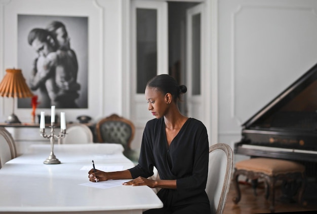
Before choosing a paint colour, notice how light enters the room and changes during the day. A north-facing room, a space shaded by buildings or trees, and a room with a large window can all show the same colour differently. Artificial lighting matters too: warm bulbs can make some shades appear softer or more yellow, while cooler lighting can bring out blue or grey undertones.
Try sample patches on more than one wall and look at them at different times of day. If possible, view a larger sample rather than judging a small paint card; a colour can feel more intense across a whole wall.
Choose a light colour with the right undertone
Pale colours often help a room feel airy, but “light” does not have to mean stark white. Soft whites, gentle creams, pale greens, muted blues and light warm neutrals can all work well. A shade that relates to the room’s existing flooring or furnishings is usually easier to live with than one chosen in isolation.
Pay attention to undertones. A grey with a cool blue cast may feel crisp in a bright room but subdued in low light. A warm neutral can add softness, though some shades may look more yellow beside cool-toned surfaces. Test the paint alongside the elements you plan to keep, such as flooring, curtains and furniture.
Keep neighbouring surfaces connected
Using related colours on the walls, woodwork and ceiling can reduce strong visual breaks and make the room feel more cohesive. This does not mean every surface must be identical. You could use a slightly lighter shade on the ceiling, for example, or choose trim in a close tonal match to the walls.
In a room with awkward angles or a low ceiling, strong contrasts can draw attention to the boundaries. A quieter palette may make those transitions feel less pronounced. If you prefer a defined edge, use contrast selectively rather than introducing a different colour on every surface.
Use colour with furniture and flooring
Walls are only one part of the room’s overall palette. Large, high-contrast items can interrupt the view, while pieces in colours close to the walls may blend in more readily. This is not a rule against dark furniture or colourful objects; it is a way to decide where you want the eye to land.
Continuity between the floor and walls can also help a small room feel less divided. If changing the flooring is not practical, a rug in a related tone can create a calmer connection. A few brighter accents—such as cushions, artwork or a lamp—can add personality without making every surface compete for attention.
Don’t rule out dark colours
A deep colour can make a small room feel intimate and intentional rather than larger. It may suit a snug, a bedroom or a room used mainly in the evening. The effect depends on the amount of light, the finish, and the furnishings around it. If you are unsure, try a darker shade on one wall or use it in smaller details before committing to the whole room.
Make the final choice in context
Consider the room as a whole: the direction of the light, the ceiling height, the shape of the space and the objects that will remain. Sample colours on the walls, live with them for a while and check them with both daylight and your usual evening lighting.
At Lightwell Living, a thoughtful colour scheme begins with how a room feels and functions—not simply with its size. A well-considered palette can make a compact space feel more settled, open and distinctly your own.